Logo & visual identity
An original JBS logo, paintbrush detail, midnight-and-champagne palette and a consistent typographic direction.
Case study · JBS Decorating
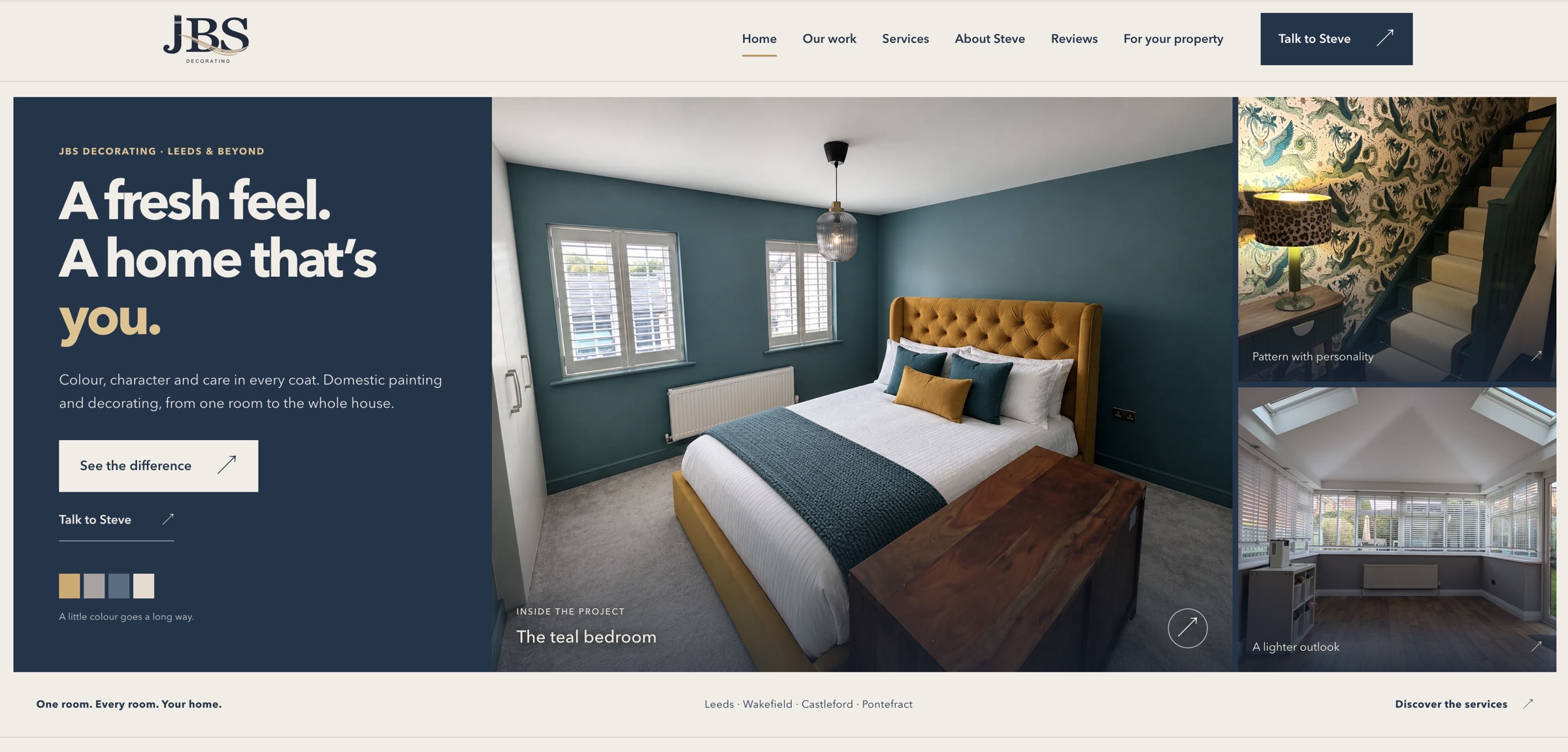
JBS Decorating needed a brand and website that reflected the care Steve puts into people's homes. We developed the logo and visual identity, then carried that character into a photography-led website where real projects, clear services and a personal introduction do the talking.
The brief
Steve's decorating work ranges from painted rooms and detailed woodwork to wallpaper, feature walls and furniture. The brand needed to feel professional and recognisable while keeping the approachable, personal character of a business where customers speak directly to the person doing the work.
The project brought logo design, colour, typography, website design and supporting Facebook graphics together. Each part needed to belong to the same business, whether someone first encountered JBS through a social post, a project photograph or the website.
Rather than relying on generic decorating imagery, the website centres on Steve's own photographs. Services, project collections, customer reviews and clear contact routes give visitors practical ways to explore the business and take the next step.
Logo design · Colour · Typography
The brand identity
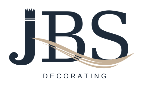
The logo turns the J into a paintbrush, pairing it with confident serif lettering and a champagne paint sweep. It gives the trade a clear visual reference while keeping the mark simple enough to carry across the website and supporting graphics.
A midnight-blue, champagne and warm-cream palette gives the identity a considered feel. Strong typography and generous space frame the work, allowing the colours, patterns and finishes in Steve's photographs to stand out.
The brushstroke also becomes an animated brand detail on the website, connecting the identity to the craft behind the business.
Show the process
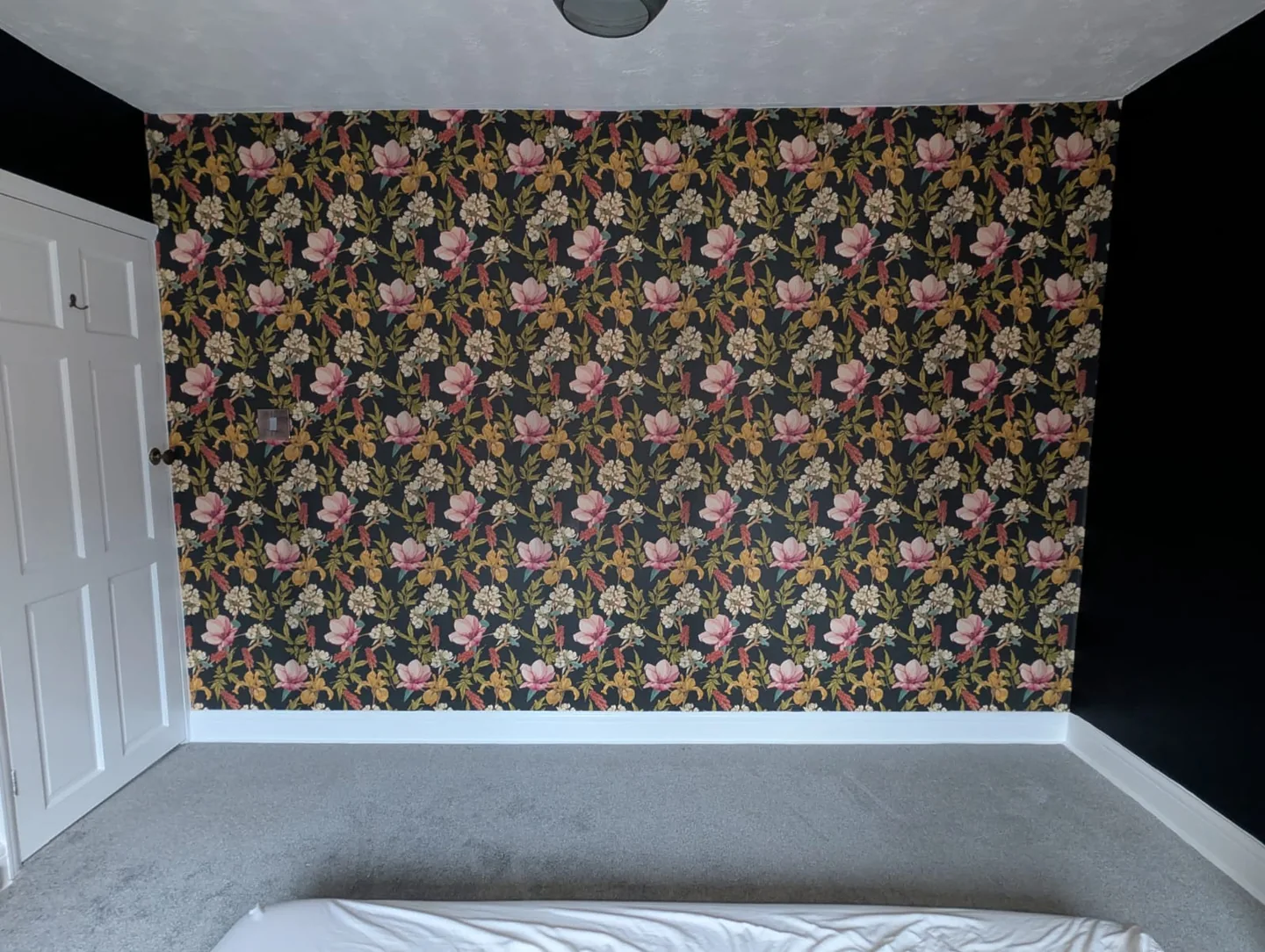
The dark floral bedroom story follows the original room, stripping, preparation and finished feature wall. It gives visitors a closer look at the work behind the final photograph.
Before-and-after comparisons invite people to explore the transformation. The original photographs retain their room context, with a clear note where camera positions differ. Real work is strongest when it is shown honestly.
Explore the bedroom project →What we delivered
An original JBS logo, paintbrush detail, midnight-and-champagne palette and a consistent typographic direction.
A responsive, photography-led website with a clear structure for services, projects, reviews and an introduction to Steve.
Individual project collections, a four-stage bedroom story and before-and-after comparisons that let visitors explore the work.
Prominent call and WhatsApp links give visitors direct routes to Steve, supported by clear service-area information.
Page titles, descriptions, canonical addresses, sitemap and branded social-sharing artwork support a coherent public presence.
Facebook graphics carry the logo, colours, real project photography and contact details beyond the website.
The finished result
JBS now has a consistent brand and a live website that brings its services, project photography, customer reviews and contact details together. The result gives prospective customers a clear introduction to Steve and the care he brings to his work.
From the brushstroke in the logo to the detail in the project stories, the design is built around the business it represents.
Have a project in mind?
A brand that feels like you.
A website that brings it together.